
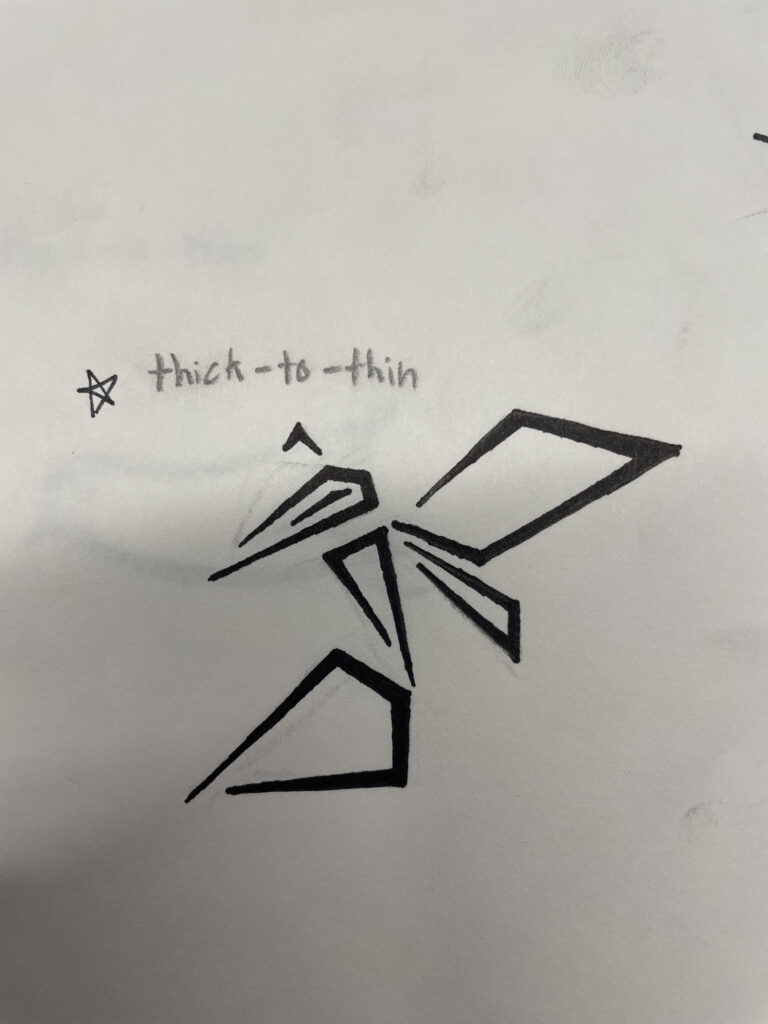
Finished doing this sketch which I am super proud of! It took me a while to actually get it to how I wanted it to look, the project was simplifying an animal, I opted to use lines that go from thin-to-thick! However I wanted to keep it as angular as possible, so it kept the feeling of it being sharp and or dangerous, because it’s a hornet which has a stigma for being painful.
There was a pretty long process behind actually figuring out how I wanted to design this, what to simplify and what to exaggerate, like the stinger and the wings, while also opting to use completely straight lines to create the form, though some might look a little more like shape. when you zoom in, you find that its 2 points that get longer in the middle then shrink back down at the tips which are still one line instead of a full shape. But I went over several other iteration of the design, one where all the lines were the same length, and in a different pose, and a design in which everything was made out of a solid shape in some form, those to me didn’t work quite as well as the one I chose above, it just has some unique personality in my eyes that can’t really be replicated with any more simplifying.
Overall, I think that it’s a good start to a final design following this philosophy which I am going to finish as soon as possible! Though it may look slightly different in its final iteration the general idea is going to remain the same.